Sunday, May 6, 2012
The History Of Motocross: Essay
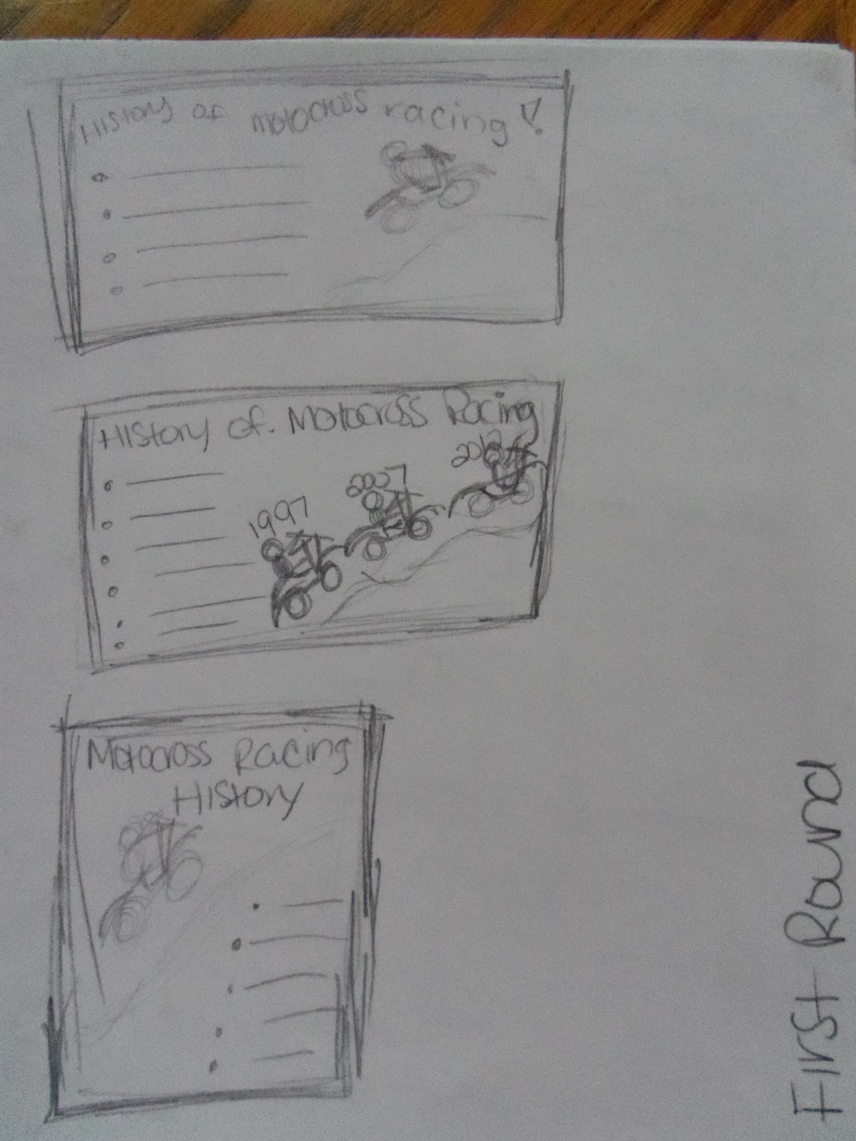
My history poster is on The History of motocross. I choose motocross because it has played a huge part in my life throughout it. the design i choose draws the readers eyes to the huge 2012 bike in the middle and gradually moves your eyes around the poster. Down the right side of the poster is a mini timeline for the history of motocross. My design conforms to the rule of thirds because nothing is placed exactly in the middle of the poster. The poster has a piece in every cordinent in the rule of thirds. Emphasis is used in my poster by the huge bike near the middle of the poster. Alignment was used because i aligned the history of motocross words with the bike suspension. Contrast was addressed in the background of my poster with the different shades in the tracks of the bike. Repetition was used for the repeat of black and green throughout the font and in two of the bikes. The piece i believe flows very well around the poster. The poster is well balanced with the bikes on one side of the poster and the history timeline on the other side. I downloaded a font to use called raprock. I then made the font black with a green outline to it all to match the huge bike. My poster follows the constructivism, and art deco design styles.
Monday, April 30, 2012

Monday, April 23, 2012


Sunday, April 22, 2012


Tuesday, March 27, 2012

Wednesday, March 21, 2012

Monday, March 19, 2012


Wednesday, March 14, 2012

Sunday, March 11, 2012

Stamp Project: Step 2 & 3

·
45 cents
·
USA
·
Theme=motocross
·
The stamp is very simple, with no detail.
·
All black in color.

·
45 cents
·
USA
·
Theme is motocross
·
The stamp is very dynamic looking .
·
The dirtbike is in contrast of the words.
·
It looks abstract.

·
45 cents, USA
·
Theme is motocross
·
The stamp is simple until you look at the border
around the words and bike then it gets interesting.

·
Swiss movement
·
The design is simple
·
Has large print
·
Text is one color

·
Modernisn
·
The lines are mostly all curvy
·
Picture is in black and white

·
Swiss movement
·
Abstract looking picture
·
The words are big and in contrast with one
another
Monday, March 5, 2012

Monday, February 27, 2012

Wednesday, February 15, 2012


Monday, February 13, 2012

FORM & CONTENT Essay
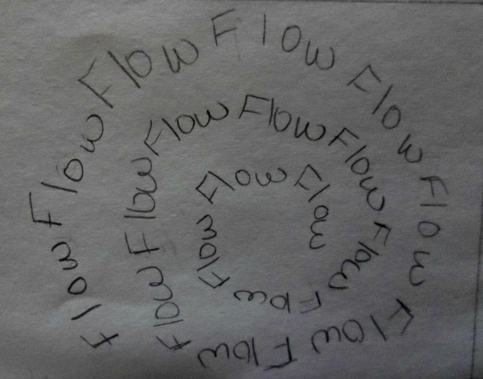
Each word design was formed into a way to work for the rule of thirds and to create the meaning of the words themselves as well as to take your eye for a journey though out the design. The eye is directed straight into the word emphasis which is placed at the bottom right third. The large bold black E really pulls your eye into the word to direct you to the end of emphasis. Balance was placed above it so that your eye is directed around the design. Balance has the A's extended so that it looks as if the word balance is balancing on a board. Your eyes next move is to repetition of which is placed in the top right third. With the word repetition being large and extended it does not direct your eye to go there first but it shows equality and variety in the design. Of coarse repetition is repeated because of its meaning. Alignment in the middle top right third is where your eye is taken on a journey to next. The L in alignment is large, bold, and extended in order for it to create a right angle which has to do with the meaning of alignment. The A is placed at the top of the L and is also extended, large, and bold with the ignment placed in a smaller non bold print on the L. Along the right side of the design is the word flow. The word flow is made up of a font that looks as if it is a river flowing off of a page. The last stop for the eye's journey is contrast. Contrast has a bubble font which ranges from dark to light values. The design all together takes your eye for a journey around it from emphasis, balance, repetition, alignment, flow, to last but not least contrast.
Wednesday, February 8, 2012
FORM & CONTENT Thumbnails


Subscribe to:
Posts (Atom)